CD Album Poster Analysis:
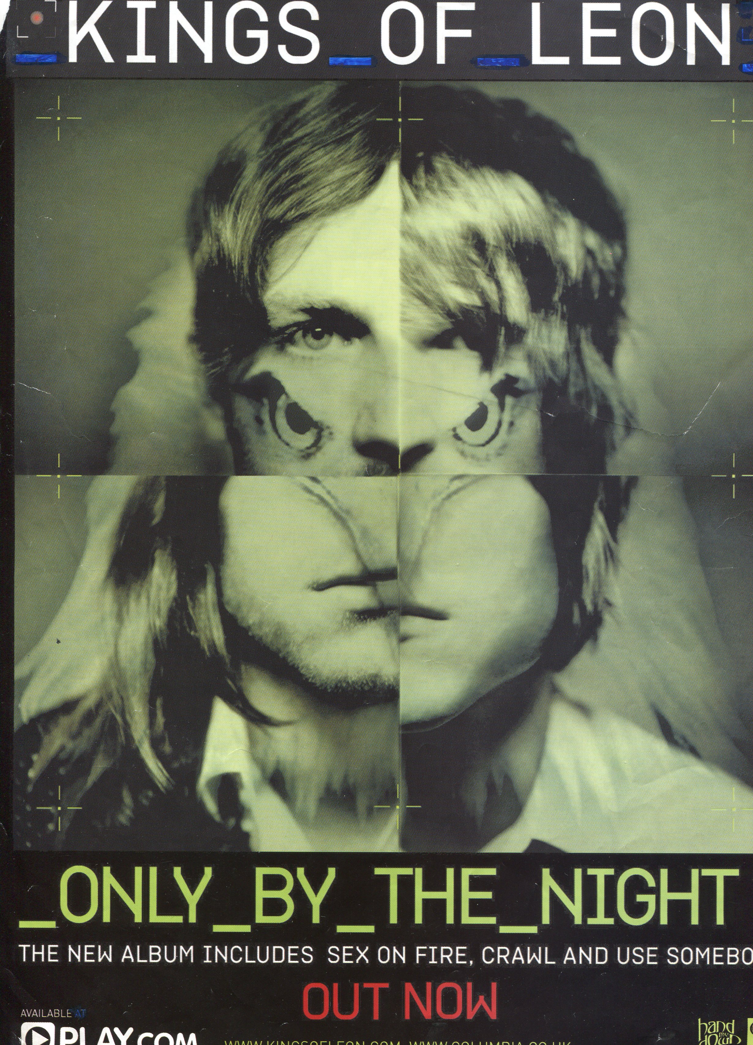
- This album poster is for the band, The Killers, for their album Only By The Night from 2008.
- The overall image is of a face that is made up of sections from the different band member's faces and a type of bird, which looks like an eagle. Eagles have connotations of strength and empowerment, feelings that are probably associated with the band/how they want their music to come across to the audience. Also, the fact that it makes up part of the face could signify that the band, too, each have qualities that make them 'powerful' within the music business and they have a lot of fans.
- The positioning of the frame is central, and everything is laid out neatly around the central image. The eyes are looking straight at the camera, engaging with the viewer, making them feel special, like they are interacting with the band on a personal level, which obviously results in sales of the album, resulting in a win/win situation for both the band and the audience because the band can make a living and the audience get good music to listen to.
- As the camera shot is a close up of the 'face', we can not see the clothing or appearance but one of the main things that indicates that this band is of the indie/alternative genre is the colour scheme, in my opinion. Dark colours, such as black and green, are genre conventions that are being adhered to in the poster. The colours make the poster look quite dated, suggesting that the music could produce nostalgic feelings, so that the music is always listened to because it is so good and doesn't go out of style.
- The font used for the band name and other bits of typography on the poster is the same blocky font. It stands out due to its colour, white, yellow and red, and its appearance. It's simple but this could say that the band are 'simplistic', which makes us wonder about the type of music that they play, creating enigma such as 'will the music be simple?', 'what kind of band are they?' however the font is contrasting to the font because the image is so unusual and unique.
- The use of the colour red for the words 'out now' shouts out to the audience, drawing the audience in visually. This signifies that the band is good and are worth listening to so the audience are drawn in to the music as well as the poster. This also creates a feeling of urgency, we must buy this album becuase it's important and the red colour has general connotations of urgency and danger.
- Some of the songs that are features on the album are on the advert, which tells the audience what to look out for when listening to the album. It also shows the success that the band have had. This is also quite a good selling point because the audience can see that the band have had successful singles, meaning that they are a good band.
- The overall poster for the album is quite mature and appeals to an older audience, older teenagers and young adults, due to the colours and overall look, which suggests that the band are also mature and possibly sing about mature themes, which I found to be quite coherent within a few different indie/alternative bands, such as The 1975 and Arctic Monkeys, where the digipaks and music videos were quite simple and mature, but the themes of the songs were quite deep and meaningful. (Inferred meanings).

- This album poster is for The Killers album, Day and Age, released in 2008.
- The image is of a horizon, with the moon placed at the top of the poster in the centre. There is a mosaic effect on the whole poster, including the typography, which in my opinion is quite an original feature for a band poster. The effect makes the image look soft, which is the opposite of the band name, 'The Killers' and it portrays the band as different, something that is a typical ideal of an indie/alternative band.
- The colours vary, from soft lilacs to dark browns signify that the band's music could also vary, from soft and slow songs to quick paced, heavy songs which again represents them as different.
- I think that the colours are a really good representation of the genre, showing that indie bands make different types of music with different tones and messages, which is something desired in music because it offers a variety for people to listen to, rather than similar music that could be said of pop music.
- The font is iconic to the band, used on a lot of their music CD covers and other advertisements. It means that their fan base can recognize their merchandise/CD covers and other things associated with the band. This sells sales and is kind of like a symbol to the band, something they can use to identify by.
- The font is quite unique too, with rounded edges and quite a futuristic look, which gives the band a quirky atmosphere, something that would be appealing to the target audience of teenagers. The colour of it is also white, which has connotations of purity, which could also counteract the band name, like the colours do, again creating a 'different' band identity and atmosphere.
- The band name is above the title of the album and the band name is slightly bigger, which might signify that the band want the audience to focus on them as a band, which could help the audience feel closer to the band. It might also mean that the band would prefer the audience to have a positive image of them over their music which isn't a typical genre convention but I also noticed that the band are not on the actual poster, which could mean that the music is more important than the band so I came to the conclusion that the band want the audience to notice them for the individuals as well as the band itself but the point of the poster is to advertise the music/album.
- The capital letters 'THE BRAND NEW ALBUM' and 'FEATURING THE SINGLE, HUMAN' are used to draw in the audience, to catch their eyes, as it is as if it is screaming out to them. The definite article of 'the' is also useful because it's as if it's saying it is 'the' album, it's very important, so the audience will buy the album to see if it's as good as it's made out to be by the typography. It also makes the band look like they are the only band, there is only one of them.
- I think the overall image of the horizon could signify that the band look to new things, new 'horizons' in their music, branching out to different sounds and music, which creates an atmosphere and band identity that we instantly like because in society, a lot of teenagers, like myself, enjoy listening to new and interesting sounds so we would buy the album.

- The overall poster for the album 'AM', is very simple, with no colour except black and white.
- The colour scheme is monotone, which is a typical genre convention of the indie/alternative genre, so it is easy to identify for the audience.
- There are no images on the poster, except for the iconic symbol of the wavy line which is most likely a sound wave. I feel that the wavy line could signify the heart rate of the listener, increasing and decreasing as they listen to the music, which could represent that the music is good and has different sounds to each song, something that is desired within music.
- The fact that there are no images on the poster also link to their early work where they weren't shown in their videos or on their CD art. It shows that they possibbly care more about their music and how people enjoy the music rather than how the audience view them as people.
- The poster is neatly laid out, with the band name at the top in the centre, the wavy line in the middle and at the bottom in the centre is the band name. The band name is easily seen so the band is easily identified and the album is at the bottom, making it easy to see this too.
- All of the typography on the poster is the same blocky font, so it is easy to read and represents the band as simple yet classic.
- The capital letters are eye catching, drawing in the reader because it's as if the poster is shouting at the audience to look at the advert, persuading them that the CD album is worth buying and it is important.
- However the writing could contrast with the band's music, because in this album and some of their other songs, there are hard hitting, deep messages, which shows that the band are more than meets the eye.

- The overall poster for Oasis' album 'Be Here Now' is bright and vibrant - going against a lot of stereotypes of the indie/alternative genre.
- The vibrant colours, blues and greens, connote that the music is probably happy music with happy messages perhaps or it could counteract this theory completely and be 'disguising' the music with a happy image when really the music is deep and emotional or hard hitting, like music from the indie/alternative genre.
- The title is iconic to the band (this is how they have had their name before on their merchandise) so it shows the audience that they are easy to recognize and consistent, which can be a good thing because it shows that they are organised, and their music is well thought out and 'organised' too.
- The colours of the band name are in black and white, the only serious note on the poster, which connotes 'classic' and 'sophistication'.
- The image is of a white car in a swimming pool, something you don't see every day. In the background of the image is a very middle class looking house and garden. With bands like the Arctic Monkeys and The 1975, they have a very working class image, and this is a genre convention so the idea that Oasis' poster challenges another genre convention. It's unexpected and unique, reflecting originality, which is how a lot of bands in the indie/alternative genre want to be portrayed.
- However the image is quite fun, and the unexpected element that it has is quite eye catching, due to the bright colours and originality of the image. It's a unique selling point in my opinion and showcases the idea that the band are probably unique and original too, with their own unique style.
- Also linked to the image, the band's music is normally quite relaxed and chilled, so the image challenges this idea too.
- The font, like on most poster adverts that I have studied, is blocky and stands out, creating the idea of simplicity with hidden meanings of complexity.

- The Kooks 2006 album 'Inside In/Inside Out' poster is a typical poster of the indie/alternative genre in my opinion.
- The colour scheme is black and white with hints of red for the typography, which is a typical genre convention of this genre. I found that the black and white colour scheme was quite common within indie/alternative posters. However, the idea of the black and white is to create the image of being different from other bands however a lot of indie/alternative bands use this colour scheme, which is quite ironic because they are trying to be different but in fact they are actually the same.
- The red writing helps the title of the album to stand out and it draws the audience in. It is also in capital letters, again another technique that helps to draw the audience in to look at the album and buy it.
- There is an acclimation on the album poster, saying how the band was nominated for awards for their music and performance as a band. Facts like this for the audience to see help to sell an album by showcasing the band's talent and showing that they have a fan base and are recognized for talent, obviously something we look for in an artist or band.
- The logo of the company that has praised them is also on the poster and I feel that this gives the poster a professional look, it has been recognized by a big company and people would recognize the logo.
- The image on the poster is of the band themselves, on their instruments, denoting that they love performing and signifying that they care more for the music than how the audience see them because they are not posing like a pop band would but they are simply on their instruments.
- The font, like a lot of other album posters from this genre, is simple and blocky, again signifying that the band are simplistic and classic but could have a hidden side that you can discover by listening to their music.
No comments:
Post a Comment